Themes
Create, install, and apply custom themes
Custom themes are JSON files in Zipline's themes/ directory. Start with the example below, then adjust its colors and other properties.
Create a theme
Save this as themes/blue_dark.theme.json:
{
  "name": "Dark Blue",
  "colorScheme": "dark",
  "colors": {
    "blue": [
      "#FFFFFF",
      "#7C7DC2",
      "#7778C0",
      "#6C6FBC",
      "#575DB5",
      "#4D54B2",
      "#424BAE",
      "#3742AA",
      "#323EA8",
      "#2C39A6"
    ],
    "dark": [
      "#FFFFFF",
      "#293747",
      "#6C7A8D",
      "#2d3e5a",
      "#222c47",
      "#171F35",
      "#181c28",
      "#0c101c",
      "#060824",
      "#00001E"
    ]
  },
  "primaryColor": "blue",
  "mainBackgroundColor": "color-mix(in srgb, var(--mantine-color-dark-9), black 45%)"
}
Theme files must contain valid JSON and end in .theme.json. Zipline uses the filename without that suffix as the theme ID; this example becomes blue_dark.
Docker
Mount your themes directory into the container, keeping the service's other volumes:
volumes:
  - ./themes:/zipline/themes
Apply a theme
Open Manage Account → Dashboard Settings and choose your theme. Select System to choose separate light and dark themes based on your browser or operating system preference.
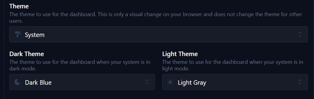
Choose a specific theme to use it regardless of the system preference.
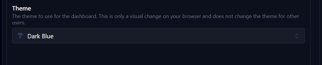
To set the default for your instance, use Server Settings → Website. See Dashboard customization.
Theme properties
Zipline uses Mantine for its interface. Theme files support JSON-compatible Mantine theme properties alongside Zipline's own fields:
| Property | Purpose |
|---|---|
name | Display name in the theme selector. |
colorScheme | light or dark. |
colors | Named palettes, each containing ten colors. |
primaryColor | A palette name used for buttons and other controls. |
mainBackgroundColor | CSS color value for the dashboard background. |
extraCss | Optional CSS, including font imports. |
Colors
Each palette contains ten colors, ordered from lightest to darkest and indexed from 0 to 9. The dark palette controls dark-mode surfaces; it isn't used for a light theme.
The example's dark palette looks like this:
Primary color
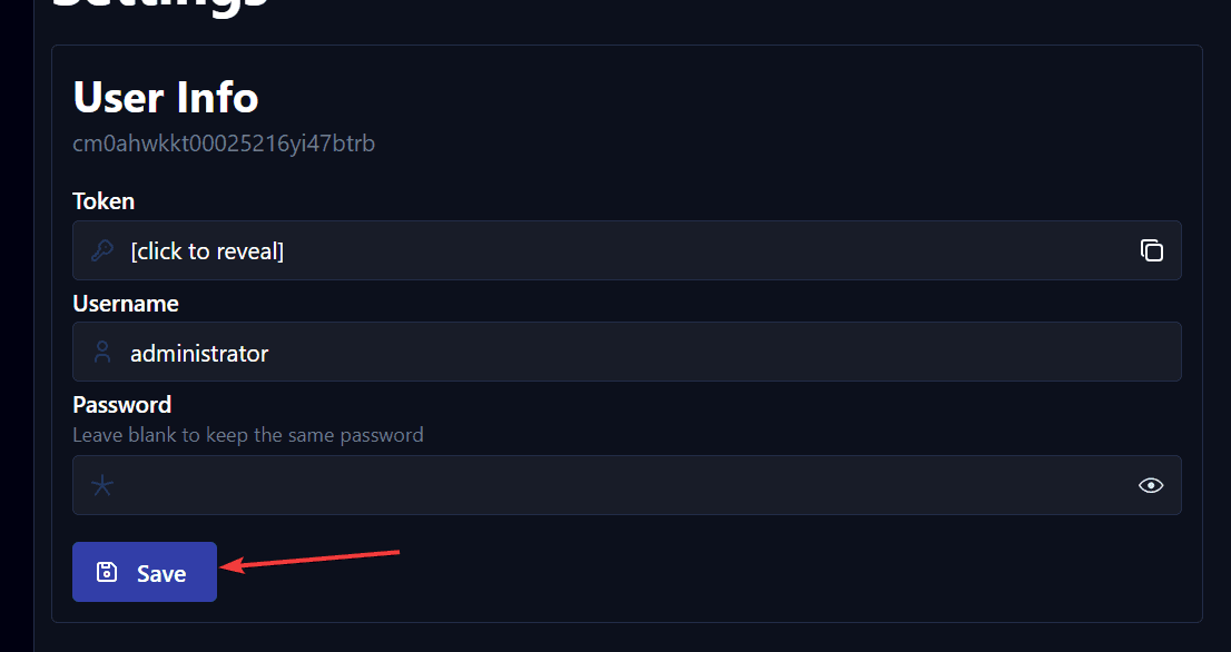
Set primaryColor to a palette name from colors, such as blue. This controls the primary color used by buttons and other interface elements.
Background color
mainBackgroundColor controls the area behind the page content:
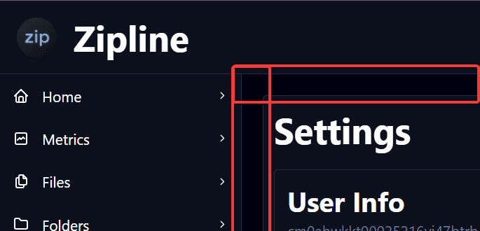
You can use a CSS color, variable, or function. For example, this mixes the darkest dark palette color with 45% black:
color-mix(in srgb, var(--mantine-color-dark-9), black 45%)Custom fonts and CSS
Use extraCss for additional CSS. This example imports Ubuntu from Google Fonts and sets it as the theme's font:
{
  "name": "Custom Font Example",
  "colorScheme": "dark",
  "primaryColor": "blue",
  "mainBackgroundColor": "color-mix(in srgb, var(--mantine-color-blue-9), black 45%)",
  "extraCss": "@import url('https://fonts.googleapis.com/css2?family=Ubuntu:ital,wght@0,300;0,400;0,500;0,700;1,300;1,400;1,500;1,700&display=swap');",

  "fontFamily": "Ubuntu, sans-serif"
}
Save the file and reload Zipline, then select Custom Font Example.
Preview changes
Edit your .theme.json file and reload the page to see changes. If the theme doesn't appear, check that the file is valid JSON and is in the mounted themes/ directory.
Built-in themes
Zipline includes built-in themes. The default System selection uses builtin:dark_gray or builtin:light_gray according to the system preference.
builtin:dark_gray
{
  "name": "Dark Gray",
  "id": "builtin:dark_gray",
  "colorScheme": "dark",
  "primaryColor": "gray",
  "mainBackgroundColor": "color-mix(in srgb, var(--mantine-color-gray-9), black 45%)"
}
builtin:light_gray
{
  "name": "Light Gray",
  "id": "builtin:light_gray",
  "colorScheme": "light",
  "primaryColor": "gray",
  "mainBackgroundColor": "color-mix(in srgb, var(--mantine-color-white), black 3%)"
}
Resources
- Mantine theme object
- Mantine colors and palette generator
- CSS color values
- Zipline Discord for help with your theme